Showing posts with label assignments. Show all posts

Tuesday, 29 May 2012

Sense of place - Rock Chair


Rationale

The area chosen is Empress park, Hurstville. This park is conviniently located in housing area and is just about 10 minutes walk from main business area. The park includes playground, bbq pit, basketball court and soccer field. Although it has strategic location and can provide various activites, it was observed that many do not stay in the park for long. From observations and interviews, the park goers can be divided into 2 groups, the morning and afternoon goers. The morning goers are mainly the older group of people (60 and above) who accompany their grandchilds (4 and below). The afternoon goers are mainly yound adults or teenagers who play sports there. While the bbq pit is rarely used.

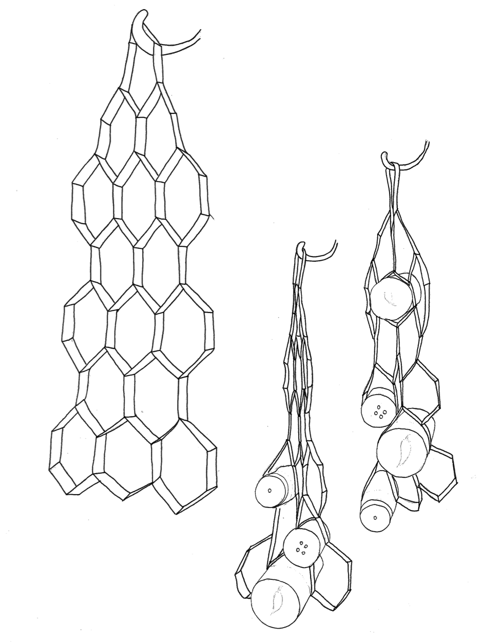
When I interviewed the grandparents why they did not stay for long in the park. Most of them said it was because they were tired of standing and were bored. This is probably because there are very few chairs in the park and these chairs are located far from the playground so they will not be able to keep a good watch of their grandchildrens playing in the playground. Thus, the rocking chair will be built closer to the playground which will enable them to relax while at the same time being able to watch their grandchilds. The rocking chair is also popular, especially amongst the older generation and this can encourage more people to come to the park or stay longer there. This is further supported by statistic which shows that the area has large proportion of older group of people (20% are 60 and above, compared to national average, 16.7%). The soothing and comfortable nature of rocking chair may encourage people to stay around longer and thus this provides more opportunities for them to intereact with one another.

The reason why the younger group does not stay there for long is quite similar too. Most of them said it was because the place is boring. The organic and modern design of the chair will likely interest them to stay around. There will be also a number of these chairs so they can enjoy relaxing and interacting with their friends after their sporting activities. These may also encourage more to have bbq in the area as more seats will be available and the rocking chair will make it more fun and comfortable to hang around.

This rocking chair has the potential to bring not only this park alive but other parks as well. This is because the rocking chair is enjoyed across different cultures and age groups.


Saturday, 26 May 2012

Video Reflections : Who Killed The Electric Car?

The film released in 2006 "Who killed the electric car?" talks about the story of electric car and its unsuccessful journey in society despite its good solution it offers. It also talks about the conspiracy behind the story, featuring how the company played the role behind the unsuccessful launch.

At the beginning the video talks about sustainability in fuel usage and possibilities to replace petrol cars to save the environment. Electric-powered car was considered by some car manufacturers as the solution to this problem. However some concerns were aroused such as consumer skeptics, competition, and limitations of the product. High cost are also one of the reason why electric cars remained unpopular in society.

It is an interesting video as it gives me insight of what is it like in the real-live workforce. Sometimes we as the designer we could propose a great design but at the end it would go through a lot of process before it can be launched and great design does not ensure it will remain successful in the market. A lot of things are affecting the successfulness of a design. Not only its economical consideration, but also the manufacturing process, environmental concern, consumer perception,etc.

Tuesday, 15 May 2012

Social Packaging Project - Memory Pill Bottle


Social Packaging - Peer Comments

1. Felicia Levina's
http://feliciaides1122.blogspot.com.au/2012/05/social-packaging.html

2. Stephanie Cai Min's
http://lovedbyee.blogspot.com.au/2012/05/studio-project-2.html?showComment=1337063826219

3. Antony Daming Chen's
http://daming-ides1031.blogspot.com.au/2012/05/project-2-packaging-design-to-address.html

4. Jan Gerardino's
http://janraymondgerardino.blogspot.com.au/2012/05/accessible-packaging.html?showComment=1337065114297

5. Dongwook Kim's
http://dongkim926.blogspot.com.au/2012/05/pacakging-child-resistant-cap.html?showComment=1337065618511

Monday, 16 April 2012

Packaging Video Reflection

I found the video ‘How It’s Made’ and ‘Giving Packaging a New Life’ very useful as they cover different kinds of materials and manufacturing process as well as recycling process of the materials being used.

The video introduces me to some of the existing materials out there, from corrugated cardboard, paper, aluminium, tetrapak, glass as well as plastic. They also explain the innovation of recycling each of those materials in details, describing each process step by step.

Corrugated Cardboard is featured first, the video explains how is it made and how they use water and starch as the adhesive to keep them safe as well as the manufacturing process of paper.

Packaging tubes and aluminium is covered next. They talk about the making process of packaging tube; which is very interesting to me, and the characteristic of aluminium and how aluminium is recycled.

The following videos talk about tetrapak, glass bottles and plastic. Tetrapak is one of the most sustainable packaging as they are recyclable as a whole and it offers good quality in storing various types of products. Glass is sustainable as well as they are easy to recycle and abundant.

As a designer it is important to watch these videos as they give deep insight to the existing manufacturing and recycling process and they remind us that selecting the most suitable materials could help keeping the environment safe.

Tuesday, 27 March 2012

Peer comments

1. Eugenie Barnet's
http://studio1-bee.blogspot.com.au/2012/03/model-pictures.html?showComment=1332807027135

2. Xiao Ya Zhang's
http://2011jj.blogspot.com.au/2012/03/project1.html?showComment=1332807892877

3. Wei Qian Wen's
http://akiwei.blogspot.com.au/2012/03/model-project-one.html?showComment=1332809500448

4. Shi Xiao Meng's
http://shixiaomeng3361028.blogspot.com.au/2012/03/rationale.html?showComment=1332809605985

5. Shermen Li's
http://laichorming.blogspot.com.au/2012/03/project-one-poster.html?showComment=1332810218884

Monday, 26 March 2012

Bio-inspired storage system final : Spine Bookshelves


Compressed

Expanded

Rationale
This design is inspired from the vertebral body of human. I found human vertebral bones as a good inspiration for designing shelves. Spinal column allows you to stand upright, bend and twist. It is flexible; it allows movement in several places. It is very interesting as they are very rigid, solid and structured but at the same time it also have liquid-like properties that resulted from the S-shape of the whole structure.

The back of the shelves that holds the structure together shows a strong resemblance to the human spinal cord while the ‘leaves’ of the shelves resemble the vertebral bones. It is flat at the back as it is mounted against the wall and from the side view we can see the contours.

The shelves shows some resemblance with human vertebral body, for instance the color, which is white like bones, and the shape and the structure. The interlocking features of the shelves also inspired from the way spine body constructing and interlocking with each other, mimicking the 4 facet joints in each vertebrae body and how muscles, membranes and correct posture maintaining the structure. They are interlocking not only vertically but also horizontally, that what makes them so strong and balance eventhough it is flexible. The bottom part of the shelves shows bigger sizes in resemblance of the lumbar spine area at human spinal column for their weight bearing function.

This shelves is perfect for high density living space. It is mounted on the wall to save floor spaces and it can be dropped down when we are ready to use it. With the interlocking features in this shelves, these shelves can be compressed together and only take a very little space on your wall; in fact it only take around 51cm when it is compressed and when it is expanded it can reach about 103 cm. When you want to use it you can slide the button that connect each shelves through the maze on the 'spine' back and it is ready to used. The height of the shelves also adjustable so it meets many needs.

Technical drawings

Monday, 12 March 2012

The 11th Hour

Watch the video here.

The “11th hour” is a great reminder for us of what has happened to the world for the past few centuries and how bad nature has become because of what human do. The video provides a lot of scientific facts, opinions, and thoughts from experts of diverse areas; which all agree at one point: that there’s a huge link between nature and human being. 

Despite the fact that human is relatively a young species, as human we tend to think that we are superior, we think we own the nature so we can take whatever we want from the nature. We forget that we are actually part of the nature. Simply look at our body; there are millions of other living creatures and organisms that live in our body, supporting our body mechanism. We can’t live without them, we live because they live in us. So in other words, we are indeed part of our nature. Human and nature cannot be separated and one does not simply superior to the other. 

However in this consumerism, money-oriented world, everything is business. Everything is measured from how much money it could gain and everything is seen through economist’s point of view. We see nature as properties that can be exploited, most of the time they destroy nature in order to gain profits without being responsible to the nature. 

Deforestation and over-exploitation of living resources is not a new phenomenon. In fact almost all existed forests in America, Europe and Asia are now gone due to deforestation. 99.99% of all species has become extinct and over fifty thousand species become extinct each year, which I believe over-exploitation plays a big role in this phenomenon. What’s ironic is that people over exploit nature in amount that is bigger than what human need, only to throw away the exceeded resources back to nature, but of course in a condition that’s already broken and destructed. 

It is sad that we unconsciously live in the black circle, we forget that what we do to nature will eventually coming back to us. For instance, deforestation will lead to droughts and droughts will destroy food sources and consequently it will cause hunger and finally deaths to animals and human themselves. 

This video also gives a good insight for designers. As designers, we have obligations to consider what consequences of each design we produce and be responsible to nature. After all, design is a search of ways to create a better world, not to destroy it. So it is important to consider “cradle to cradle” concept instead of stop at “cradle to grave” concept. 

As designers we also have to explore what can we learn from nature because if we pay attention, the nature is really a great teacher. Human spend a lot of money in searching and developing strong material or structure while if we look at nature, spider’s silk is up to 5 times stronger than steel of the same diameter, not to mention minus the pollution and the hazardous waste resulted from the making process of steel. 

Well of course it’s not easy to solve this global problem, but rather than do nothing and keep doing what we do, as a consumer we can contribute to make this world a better place by voting. Vote for sustainable products and pay more attention of the products we buy, think before we purchase something; is it sustainable, how they are produced and in what material that product is made. 

Tuesday, 6 March 2012

Bio-inspired storage concepts

Concept 1 – Bookshelf inspired by human vertebral body


This concept is inspired from the vertebral body of human. I found human vertebral bones very interesting as they are very rigid, solid and structured but at the same time it also have liquid-like properties that possibly resulted from the S-shape of the whole structure. 


The core of the shelves that holds the structure together (the tall cylinder in the middle) shows a strong resemblance to the human spinal cord while the ‘leaves’ of the shelves resemble the vertebral bones. It is flat at the back as it is placed against the wall and from the side view we can see that the shelf have contours that is almost shaped like number ‘3’ or ‘S’ (rising at the top, then goes thinner in the middle and then goes bigger to the end). 

The shelf is designed to store books as it is placed against the wall but it is not necessarily limited to books, it may extend to other objects. But despite of the physical function of this shelf, the other aim of this concept is to evoke emotions to the users, to have the same feeling we have when we see human bone structures; the feeling of strength and power.


Concept 2 – Shelves inspired by termite’s nest


For this concept I got the inspiration from the complex structure of termite’s nest. The nest consists of many horizontal layers which are connected by spiral staircases. Termite’s nests are punctuated by a maze of tunnel-like galleries that effectively provide air conditioning as well as allow the termites to move through the nest. There are several entrance to their nest and they are well protected. 


Like the actual nest, this shelves consist of many horizontal layers that are stacked together, creating space to store objects from books, DVDs, or it can be used to store shoes and sandals as well. Mimicking the spiral staircases of termite’s nest, the structure of this shelves are well supported by stacks of layers (possibly using MDF sheet) that support each other balance.

Concept 3 – Spice rack inspired by honeycomb


Honeycomb has been an inspiration in many design process, I believe because a hexagonal structure uses the least material to create a lattice of cells within a given volume. What I’m trying is to apply this geometric efficiency as a solution in designing storage for small spaces. 


This spice rack is made from fabric or some kind of material that is elastic (I’m still keeping my options open). It can be flat-packed when it’s not used and while we are using it, it only needs to be hooked. It also has the flexibility to store more or less as required.


Which one is your fave?
Feedbacks are welcome!

ciao!

Tuesday, 18 October 2011

Project 2 Studio 2011 - Upcycled Utility / Pendant Light


Cutting diagram 1:5

The main concept of this lamp is actually to simply celebrating the characteristic of the material itself and to play with shades/shadows. One of the best characteristics of this material is that it won’t tear easily. I have been playing with that characteristic to create a lamp that looks hard to make with paper because paper could easily tear apart. Synthetic paper is nice because it has similar characteristic with paper and plastic at the same time.

The shape of the light looks heavy and complicated, but delicate at the same time. The layers are contradicting with each other as it is facing different side, but yet it is successfully gathered in one harmony. These ‘contradicting’ layers also create nice shade as the light managed to get out of the lamp through this space. And when the light is on, not only the shades come out but the colour from the poster on the back also peek out and thus creating a very nice colour and shades. I put the light bulb at the centre so that the light could be distributed to the whole lamp. It’s also nice to see that in several spots when it is near the light source, the material begins to show it’s transparency .

I’ve avoided folding techniques in the making process because the material is pretty thick thus it’s hard to fold and hard to make a crisp line. I decided to use cutting or slicing techniques and tried to produce a lamp with waste as minimum as possible and with less part so it is easy to assemble and to flat pack. I arrived at making this lamp with only 1 flat piece of paper joined by nuts and bolts.

The particular poster (Cowboys & Aliens) was chosen because I found it beautiful as it has nice colour gradation throughout the whole poster. I managed to capture the beauty of the colour in my lamp, which consequently has 2 major colours like the poster, blue and brown. These colours blend well as each colour is complement to each other and one colour is not stronger than the other. Those 2 colours are also in balance as they have the same level of gradation, which is captured beautifully when the light is on.

Tuesday, 27 September 2011

Bill Moggridge - What is Design?


As the title, Bill Moggridge in his lecture addresses the question of ‘what is design?' and he also mentioned many examples of good design and bad design as well as process and changes that happened around design. One of the main point that he presented is that design is not just about making a beautiful or fancy products but almost everything is designed, almost everything that is used and man made is design. Therefore, it can be said that other professions that we previously think are far different from a designer; like chefs, business people, etc; they are also designers. 

He then points out some examples of good designs in various areas ranging from design for disability, fashion design to architecture. Contrarily, he also points out some bad design as he stated that someone couldn’t recognize good design unless he take a look at the bad one as well. The remote control he used as the bad example simply expresses the fact that sometime simple is better than adding complicated details that might bring confusion to the user and thus become an unpleasurable product.

Human-centered design is again highlighted but this time it is not only interpreted as a design that focuses on the user experience but it is also about the sustainability of it. These days people has become more and more care about environment and thus, we as designers are reminded to think carefully what is the effect of our design on earth.

The issue of sustainability also aroused in this lecture but he didn’t talk only about the disassembly or the process of choosing material but he also highlighted the expanded concept of sustainability as a global aspect. He introduced the profile of Professor Shinichi Takemura who has been learning how the world is connected in an very intimate way, either the connections between people or the connections with the surroundings. The tangible earth demonstration by Professor Shinichi Takemura really caught my attention, not only it is the first interactive globe but it also strongly captures the interconnectedness of our world, how one aspect could affect many other aspects as they connect with each other in so many different ways.

Wednesday, 14 September 2011

Project 1 - Peer comments


Here is the blogs where I have commented on:
1. Jackson Walker's blog
http://studio3289813.blogspot.com/2011/09/experience-enrichment.html?showComment=1315993097637
2. Clement Yoong's blog
http://clementyoongides1031.blogspot.com/2011/09/project-one-experience-enrichment.html?showComment=1315994161858#c6450951944061786469
3. Rainbow Tam's blog
http://rainbow-tam.blogspot.com/2011/09/product-poster-usage-storyboard-and.html?showComment=1315996586791#c6981646300370024083
4. Oun Vimolpatranon's blog
http://www.blogger.com/comment.g?blogID=6561537982608082039&postID=2757288373634078349&isPopup=true
5. Camille Kordek's blog
http://camillekordek.blogspot.com/2011/09/project-one-hero-shot.html?showComment=1315998125582

Tuesday, 13 September 2011

Project 1 Studio 2011 - Mortar & Pestle


Rationale
Besides its unusual shape and the way this mortar and pestle assembled, the main thing that distinguishes this product from the one in the market is the expanding shape of the pestle towards the lid. Not only it has a fitting diameter handle for our handgrip, this shape also prevent our hand slipping over the pestle and at the same time it reduces the power needed to hold the pestle tightly while using it. Furthermore, the concave interior of the mortar aims to avoid the objects being spilled out during pounding and grinding.

I actually put a lot of time sketching and making mock ups to get the best size and shape of these tools. The main difficulty is to make the size of the mortar and the pestle in balance but not to put aside the overall look as they are also stand as one piece. The size and shape of the mortar will affect the size and the shape of the pestle and vice versa. Finally I arrive at this size where the mortar is not as small as the one used in medical place and not as big as the one in the market (those big stone and granite mortar) but big enough to make sauce or paste.

Another main feature of this tool is its material, which is stainless steel. The reason why I choose stainless steel over other material is because it has some technical properties that offer some benefits such as;
  • Strong and long lasting 
  • Better than stone because it is cohesive and corrosion resistance; small bits of the mortar and pestle won’t get mixed with the objects 
  • Better than wood because it is not absorbent and non-porous; won’t absorb/ trap the ingredients being ground and prevent the growth of microorganisms from the food particles that are left in the mortar and pestle surface
  • Non-reactive with alkaline or acidic foods so it is safe either for food preparation or medical use
  • Easy to clean; dishwasher safe


Technical Drawings in A1 (Click the image to get better resolution)
Feedbacks are more than welcomed :)

Tuesday, 23 August 2011

Annie Leonard - Storyofstuff Project


After watching the video I realized that I usually do not give much attention to the product I use. I never really check the material or ingredients of a product and I believe most of us never really think about it either. I found this whole series of videos very interesting because Annie Leonard presented some facts that never been out there before and pointed some ideas that probably never come across our mind.

These videos are good reminder for us both as a customer and a designer. As a customer we have to pay much more attention to the product we use, whether it’s a good or bad, honest or dishonest product. What’s the point of buying a cosmetic product when at the same time it harms our body or buying a more expensive bottled water when actually there’s no difference with the cheap one. We have to be smart in choosing what we would to wear or use because at the first place, we spend our money to buy products that will bring us a better life, not to endanger us.

It is really hard indeed to find a honest, good product because for the purpose of marketing, any producer or manufacturer certainly will try to ‘hide’ the ugly sides of their product or even deceive us customers by stating false facts like material, etc. Therefore we have to put more effort to find out the truth ourselves if we want to guarantee that the product we are using is totally safe. But then, in this era when technology is much more advance, we can get the facts online easier or we can share our knowledge to others as well, just like what Annie Leonard did.

As a designer we are also reminded to not design something that could harm people and the environment. It’s really good that nowadays more and more designers start to put environment to consideration when designing something. 3R; reduce, reuse, and recycle is now often practiced by designers and it doesn’t mean that they sacrifice their design because in fact, so many eco-friendly products out there are pretty amazing. In short, less material and eco-friendly doesn’t mean ugly.

Wednesday, 17 August 2011

Sydney Design 2011 Festival

Some sketches of my favourite product design from 5 exhibitions in Sydney Design 2011.
Feedback is welcome, enjoy :)


ciao!